Part 1 – DE STIJL / BAUHAUS / SWISSS TYLE
DE STIJL
(1910 – 1930)
Influence by the futurists and constructivist, It was an artist movement that wanted to rebuild the world by getting away from personal feelings, political and cultural themes. In other words, they wanted to give a more universal meaning to a composition. They used math, harmony, square shapes, horizontal and vertical lines as well as primary colours. Later on they also allowed a 45 angle degree. It was predominated by Sans Serif fonts and white-space. However the rigidity did not permit the movement to develop solution for all the design problems.
Their philosophy was “The old is connected with the individual. The new is connected with the universal” Theo Van Doesburg


De Stijl in current time


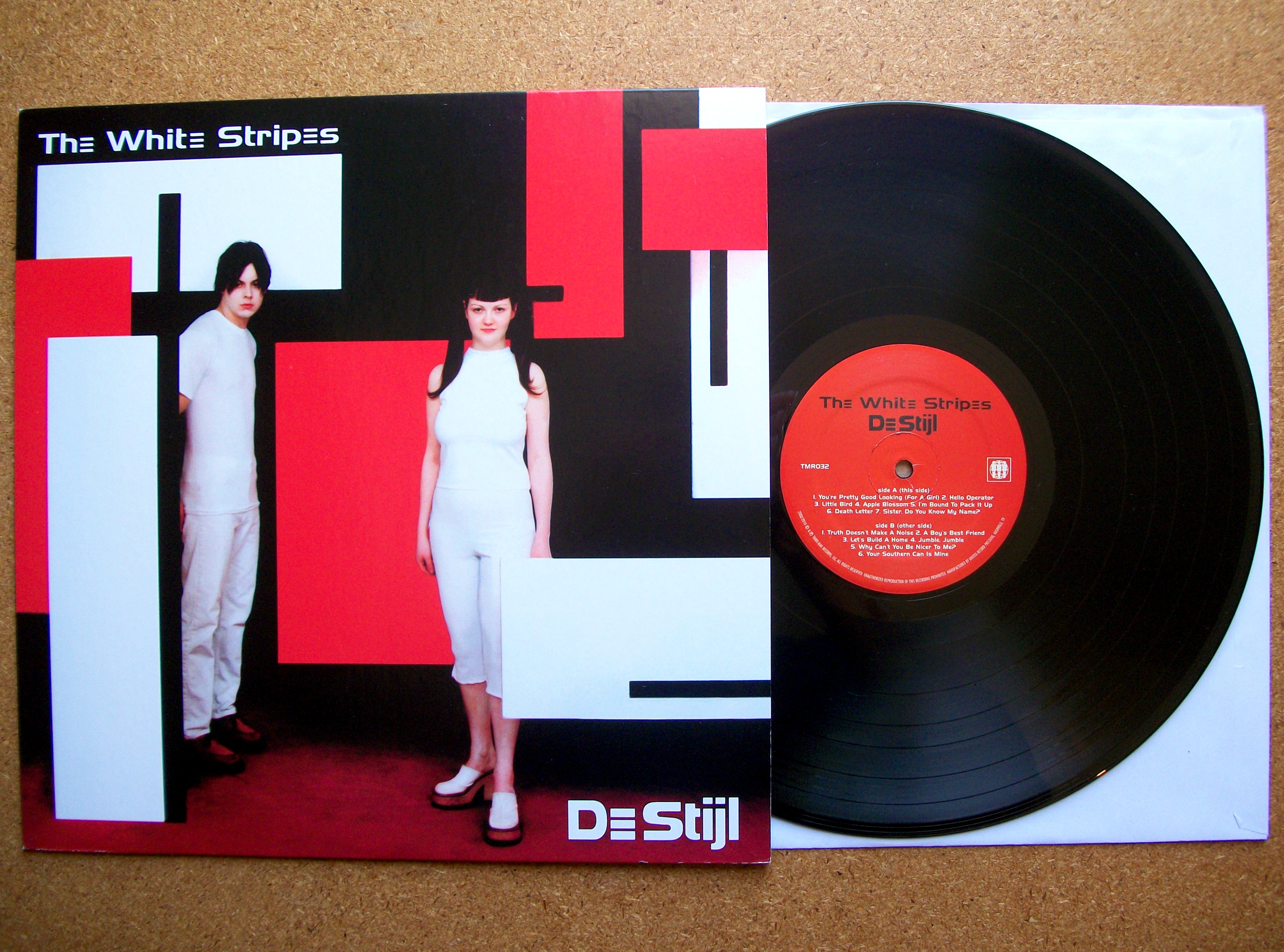
Here a lamp, cosmetics and an album from The White Stripes from year 2000 called De Stijl.
There you can observe the usage of primary colours, horizontal lines , vertical lines and squares. For The White Stripes album It can also implies that they are abstracted to their minimum expression since they are conformed by just 2 member in that band.
BAUHAUS
(1919 – 1933)
The Bauhaus was a design school based in Germany. They incorporate all the previous movements such as constructivism, futurism, Art Nouveau, Jugendstil, and arts and crafts in order to train the designers in all fields. They also though that the old way of thinking and corruption leaded their country into the catastrophic war and that design would create a better society. They worked under the principles of high quality, geometric and refined typography, Ornament was corrupt and unnecessary, materials should mirror its natural form, and design should be functional and follows a purpose and a hierarchy. They used actively sans-serif fonts, Grids, the Golden Section and photography with a cinematic approach and primary colors.


Bauhaus in current time

In this example we see a modern building that clearly express the Bauhaus principles with geometry, grids, material like glass and metal, good quality design, and mathematical proportions.
SWISS INTERNATIONAL STYLE
(1940 – 1970)
It was a style that relied on order, mathematical proportions, and a rigid grid structure. The Swiss international style was influenced by DE STIJL and the BAUHAUS and share many common elements of design. They thought that a designer needed only a single sans-serif typeface such as akzidenz grotesk or Helvetica. A flush-left, ragged right-alignment was preferred. Color was used either to highlight information, or create a focal point, or as large color fields. They also share with Bauhaus the idea that a design should be functional, best quality, aesthetically beautiful, clear and legible


The Swiss international style in current time


In those two examples we can see that not many colours were used, however shows dinamism, clear images with good contrast and proportions, simply and functional.
Links
http://www.designishistory.com/1920/de-stijl/
Part 2 – Swiss Design Style timeline

Here a timeline for the Swiss international style that starts by its earliest influences up to its time. It then shows the movements that later either follows or reject their principles up to current days.
I can see that the principles of current graphic design are based on this style.
