Brief
The US-based company «Door to Door Organics” are planning:
- An expansion to your local community.
- Partner with local organic farmers to bring fresh seasonal produce right to the customer’s doorstep.
- The company recognizes the need to develop a new logo and visual identity to suit new customers and markets.
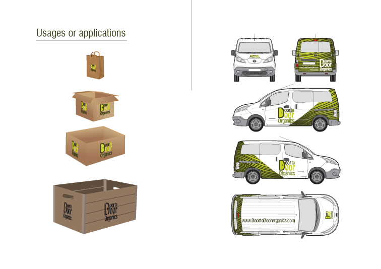
- They will also need suitable packaging for their products and decoration on the delivery vans.
- The logo and visual identity is to be presented in a brand manual.
Based on the brief I followed the next work process:
Research
- Client – the target group
- Competition
- Drivers and barriers
- Brand architecture
- Key stakeholders
- Value proposition
- Key products or services
- Mission and vision
- Attributes or core value
- The company actions
- How does the company define itself to the outside world as well as to the internal audience
- Expectations
- The world of the business
Clarify the Strategy
Based on all of this information I was able to define the current brand strategy and cross-check that my results were consistent with the clients info.
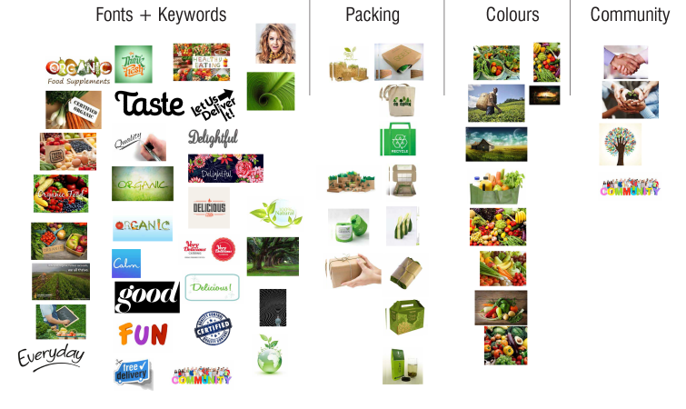
From the research I came across a list of key words, adjectives and nouns that i then use for gather images, textures metaphors or even pieces of history.
Design the identity
From here I used those elements as guides for font styles, colours and shapes giving at the same time pieces or tools that you can work with. This allows you to always be inside the client’s world.
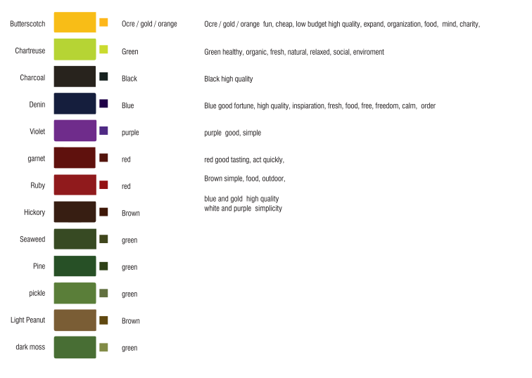
Next I did a search in colours composition and harmonic pallets from those images
Then In I was able to choose the colour pallet that was most functionall and that gave me a broader colour flexibility. I also crosscheack the colours i got from my research with clolours phsycology. This gave me a better base when choosing the colour pallet.
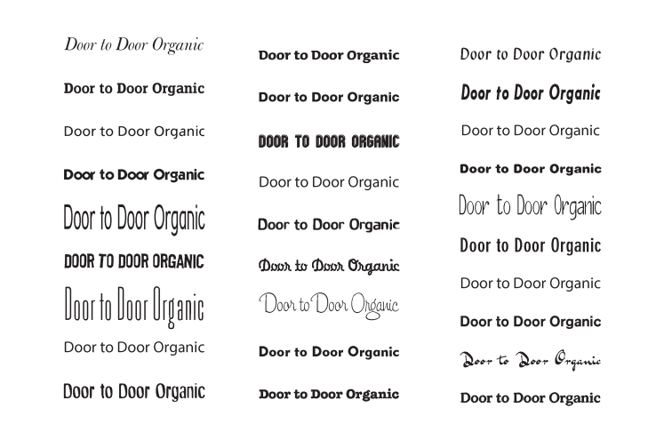
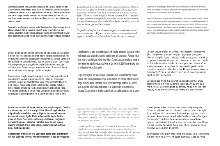
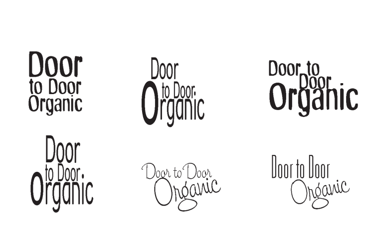
Afterwards I used more or less the same process for choosing the font both for the logo and the paragraphs.
At the beginning I had over 50 type fonts that were linked to the concept. then I began to filter them by more legibility.
I also came across that I wanted to insert elements from the original company site but I found that the elements the used and the ones I was choosing were different. However I found a font that kind of enclosed both elements and worked very well for me and for this job
The next step was basically mix and match the elements and experiment with shapes and fonts and literally play with them.
Finally the whole thing began to take shape and it was time to experiment with colours
I also find appropriated that there should be includes and stencil font that can be used to print over wood boxes that are going to be used for the delivering. that way the boxes will be marked and storage for a continuously use.
Create touch points:
- The Brand Manual
After all this work was done it was time to tell what is the point of all this and why the company´s should follow certain rules.
This is achieved by creating a user manual for the visual system, allowing other designers to keep the same harmony and consistency.
- Applications – Packaging and car wrapping
Managing assets
After all this process is finished and delivered to the client it is very important that the company build awareness of the brand and communicate the values internally and externally, deliver the promise and create products and services that provide benefits that costumers expect given the promise the brand has made. The actions and products create perception.
There are strategies and tools that helps clarify and enhance those goals. However they will surely be taken in further units.
